The Creative Process Behind a Hand-Painted Hebrew Verse Artwork
When people see a finished painting, it often looks like everything came together easily. The colors feel balanced, the composition works, and the final result appears almost obvious.
But the reality behind a painting is usually very different. My artworks go through many adjustments, changes of direction, and sometimes even complete restarts before reaching their final form.
Why the Creative Process Matters
Every painting begins with an idea or a general direction. Sometimes the concept comes from a verse, sometimes from colors or atmosphere.
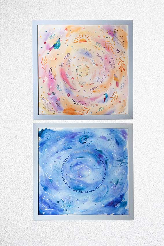
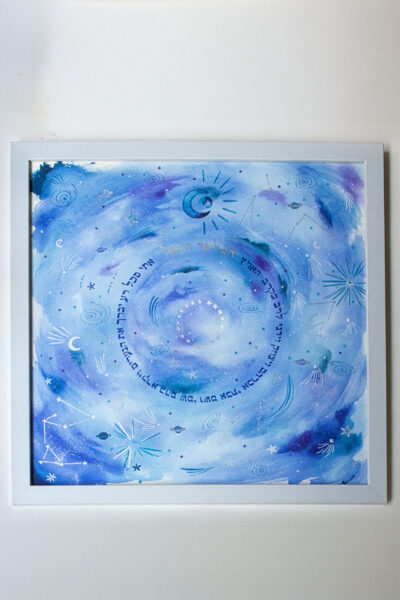
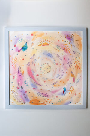
In this particular commission, the client asked me to paint two pieces for a babies’ room based on two Hebrew verses: Modeh Ani and Hamalach Hagoel.
The Modeh Ani prayer follows a daytime theme because it is recited in the morning. Hamalach Hagoel has a more nighttime atmosphere since it is traditionally said before bedtime.
You can learn more about the meaning of the Modeh Ani prayer here
The clients had liked a matzah cover painting I had previously created, so we used it as inspiration for these artworks.

Searching for Inspiration and Planning the Painting
Before starting a painting, I usually spend hours on Pinterest looking for inspiration, reference images, and color palettes.
Once I have a direction, I make a quick sketch of the composition. I show it to the clients so they can approve both the layout and the color palette. After everything is validated, I begin painting.
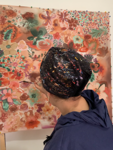
Sometimes the first attempt works immediately and becomes the final piece. Other times I need several attempts before reaching the effect I want.
For this painting, I had a very specific idea for the background. However, the first version felt too rigid. I wanted something softer and slightly blurred.
Trying Different Background Techniques
At that point I began testing different approaches. I layered colors, softened edges, and repainted certain areas until the background started to feel more balanced.
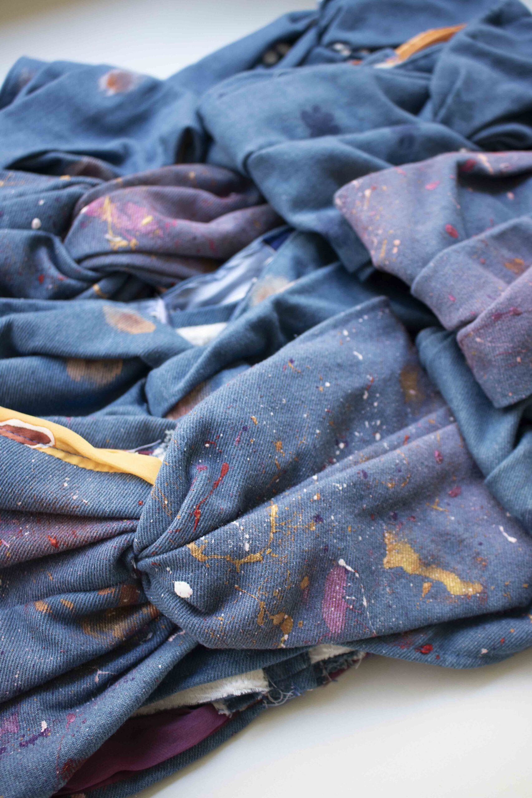
These adjustments are often invisible in the final piece, but they are an important part of the creative process.
Adjusting the Details of the First Painting
Once I found a background technique that worked, I continued building the painting. Some details still bothered me. For example, I had added long lines in the upper part of the composition. The more I looked at them, the less I liked them. Since the painting was already advanced, I decided to leave them for the moment and decide later whether to remove them.
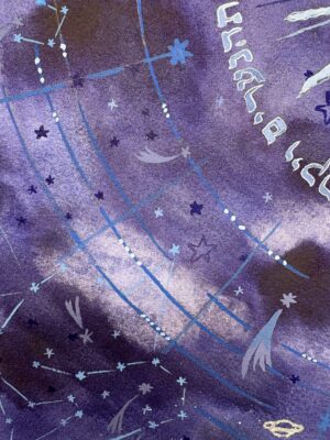
Another detail that didn’t fully convince me were the stars in the center of the composition. They ended up too close to each other. By the time I noticed it, I had already painted two of them. The only option was to continue so the composition stayed coherent.
This is often part of painting. Once certain elements are on the paper, you have to adjust the rest of the composition around them.
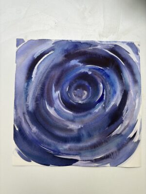
When the Painting Became Too Dark
At the end, however, I realized something else was wrong. The colors were much darker than I had imagined. I had spent hours looking at celestial atmospheres and night skies on Pinterest. I stayed in that palette while painting. Visually the result was interesting, but when I stepped back it felt completely wrong for the context.
This painting was meant for a babies’ room.
Instead of something soft and peaceful, the atmosphere looked closer to a mystical or gothic style. I actually like that aesthetic, which is probably why I moved in that direction without noticing it. But it clearly wasn’t right for this project.
So I reworked the color palette and lightened the painting until it matched the idea of a gentle night scene for children.
Painting the Second Artwork
Once the first painting was finished, I started the second one. The process felt much easier. I already understood the background technique and the movement I wanted in the composition. The painting progressed faster.
However, another issue appeared. The palette was becoming very pink. Since the paintings were for twins and I didn’t know their gender, I didn’t want the piece to feel too feminine.
To balance the colors, I added warmer tones like yellow and orange. The pink remained present but no longer dominated the painting. The palette finally felt balanced.
Discover More Hand-Painted Judaica Artwork
f you would like to explore more Judaica paintings, you can discover my work on my shop